Aaron Penne: Apparitions on Art Blocks
Artist Spotlight is ARTXCODE's community initiative focused on showcasing talented artists beyond our roster.
“The programmer, like the poet, works only slightly removed from pure thought-stuff. He builds his castles in the air, from air, creating by the exertion of the imagination.” – Frederick Brooks
Apparitions is an exploration of the space between the algorithmic and organic. My goal as a generative artist is to create artwork that inspires curiosity, leading viewers to simultaneously see the work as computer generated and hand crafted, because it *is* both.
Background
The initial inspiration for this algorithm was a visualization published in 1893 by Levi Walter Yaggy. This chart caught my eye for a few reasons: the way birds are used to mark cloud types, the colorful layers, and the fact that it was made ~120 years ago.
I wanted to replicate the colorful layering and use it to give a sense of smooth cliff sides like I experienced while living in Southern California. I approached this by drawing multiple straight lines across the screen, and perturbing them according to an underlying noise field. Each line is actually hundreds of connected points, offset according to various rules. The colors in the initial algorithm were chosen from a hand picked set of ~20 colors sourced from photos of my friends wedding and vintage data visualizations.
Here are examples of the early outputs from 2019:
During this early exploration I was using cliff sides and geology as the driving visual theme, but over the years I gravitated towards light and airy forms. When iterating on the project for Art Blocks, I intentionally worked towards a more fabric like feel. The result is that a wide range of outputs is possible, from rigid mountains to floating sheets.
Creating 1500 Unique Artworks
Typically when working on a generative artwork, the artist gets to curate the outputs, only showing a handful of the most visually appealing pieces. As we know with Art Blocks, there is no artist curation, the collectors are invited to be part of the creation process itself. This is simultaneously exciting and terrifying. The nature of the generative minting process means we have to ensure all outputs are interesting and visually 'good'. This means weeks of running the program, finding a strange look, then spending hours coding it out of existence. Or finding something surprising and interesting, and coding that *into* existence.
To ensure the variability was wide while having consistent output I focused on 18 parameters, driving 14 features. These affect the visual style, positioning, and color palettes. Some of these features are discrete categories, while several features rely on continuous ranges. The discrete categories are like A/B/C, while the continuous categories are like 'any decimal number between 0 and 1000'. For the continuous features, I found a threshold where the composition changed and applied names to the ranges on either side of that threshold. Combining the effect of multiple continuous ranges means a near infinite amount of possibilities can occur within the feature set.
When looking through Apparitions, you certainly should hunt for rarities like Backdrop Syncs and the Light/Darkness colors, but you should also hunt for Apparitions that resonate with you visually. The most appealing compositions are not necessarily the most 'statistically rare'.
The Bands feature is a good example of the potential complexity. Bands are controlled by parameters that give both discreet categories and continuous ranges. If the 10th hash pair maps to below 0.3 (between 0 and 1), then the bands are solid, giving the distinct hard line look. Otherwise, the 8th hash pair controls the width of the Bands by using a range between 10 and 200. Anything between 10 and 50 is labelled Narrow, between 50 and 170 is 'FM', between 170 and 200 is Broad. This means two Broad banded Apparitions could look quite different. I spent a lot of time ensuring the naming thresholds made sense and aligned with how I interpreted the look.
Behind the Scenes
Initial testing on the Rinkeby testnet had a focus on sandstone colors, selected with the Zephyr method (described in the Colors section below). Continuing the original motifs of cliff sides and smooth desert formations kept the outputs focused around earth tones. The first iteration had all of the Rinkeby outputs looking like a sea of beige and brown. Keeping the colors constant provided the flexibility to focus on tweaking other parts of the algorithm. Here, I was deciding between a shadow/light implementation:
Apparitions have so many interplays between features that it was difficult to isolate one thing and identify its impact. To deal with this I tied major features to sliders and hosted it in a development environment that I could access from my phone. This way I was able to extend the amount of development time, and explore the parameter space from more places than my desk.
This allowed me to find bugs like these:
During the months spent working on this project, I would get focused in on certain color schemes. There was a week or so where everything was Rileys, just black and white. As an opart fan I find black and white stripes endlessly interesting. The color palette Riley is of course named for Bridget Riley, the seminal artist who specialized in mind bending black and white opart. She is an inspiration to me and other generative artists. Another color palette that I became obsessed with for a few days was black and red. It brings a haunting depth, and was the basis for the Oracle palette picker where one randomly selected color is used alongside black and white.
Writing the core algorithm was relatively quick as I knew exactly what I wanted it to do. Maybe 2-3 days. At the beginning of a generative art project it's easy to feel like you are getting what you're envisioning. However, it took months of tweaking this algorithm to get the desired outputs, variation, and colors. Once you start iterating on an idea, the ideas compound, and bugs become features, and the artwork starts taking on a life of its own.
Features
Some features are distinct and searchable on OpenSea, like Colors or Positioning. These are what the statistical rarity scores are based on, but they are a small subset of ways to interpret Apparitions. If you are interested in the distribution of searchable features you can see aerotrader's breakdown at rarity.studio.
Some features are the combination of multiple features, like when Facing You and Vertical combine to create a watercolor strip. For example #881 and #319.
Some features are emergent and hidden, like a sneak reach #567 or background fade #320.
Some features are bugs, like invisible syncs #1426 and #1384.
Some features have entire feature sets within themselves, like the chance based color pickers: The Oracle, Three Fates, or Zephyr.
Colors
Zephyr, The Oracle, and Three Fates all pull from a curated palette of 30 colors, but in different ways. This means they are not color palettes, but have a huge amount of unique palettes within each.
The Oracle contains one random color, black, white. The Oracle had a 20% programmed chance of occurring, with 17.7% of Apparitions getting it. However, any Oracle had a 1 in 30 chance of being a particular color, so Oracles actually have a 0.5% chance of being the same color as another Apparition.
Oracles are unique within themselves: #905, #1287, #1080.
Three Fates contains three random colors (with replacement), black, white. The Fates had an 18% programmed chance, matching the percent of actual Fate Apparitions created. However, there are 4060 possible combinations of colors, therefore the chance of a Fate being the same color scheme as another Apparition is 0.005%.
Zephyr is special, as it is part of the original vision for this project. A Zephyr picks a new random color with every band or stripe. Therefore having a matching Zephyr color scheme is **virtually impossible**, although Zephyrs can have a similar overall color feel since the same palette is being sampled so frequently.
The other 25 color palettes behave like normal color palettes, with 2-5 colors each. These are carefully curated over the past several years, pulled from my photographs, vintage data visualizations, Wada Sanzo palettes, and personal favorites. Naming these palettes was a creative project in and of itself, I wanted to match the feeling I got from the colors and give nods to inspirations and important people. I adjusted the chance of each palette occurring to be between 1-5%, with Light and Darkness having increased rarity with a 0.5% chance each.
Positioning (discrete)
15% chance for Horizontal, 15% for Vertical, and 70% for Floating.
Stretch (continuous)
This feature is controlled by the level of detail along the x-axis of the form. Each "line" is made up of 100-300 nodes. The more nodes, the higher the detail, and the more compressed the form. From most stretched to least: Taffy, Smooth, Compressed.
Haunting (discrete)
This is a primary feature, and determines the way the "ripples" or "folds" look. The names for the varying levels of Haunting are tied to the amount of chaos introduced into the form:
Premonition - The haunting is so small that there is only a thought of it. Patterns are more subtle.
Periodic - Disturbance happens at random. This is the natural state, the initial vision for this project.
Persistent - Reliable, recurring, there is one shape that is repeated for all bands, giving a unique smooth look.
Poltergeist - All hell has broken loose.
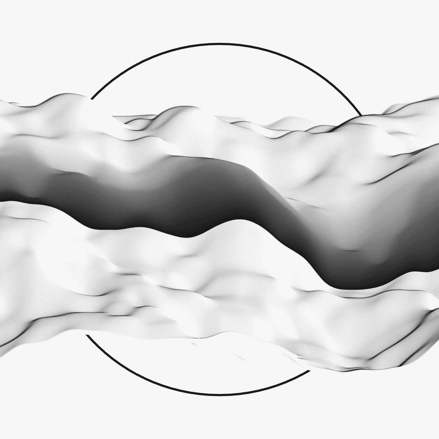
Facing (discrete)
The direction that shadows are drawn changes according to the direction the Apparition is facing. More depth is given in the East/West variants, but there is something powerful when the Apparition is Facing You. Combined with Vertical positioning and Blended brush style the Facing You variants create an emergent feature I call "watercolor strips".
Below is a collector's set titled Dualism, showing East and West facing Apparitions. This set in particular, collected by @philbert has striking balance. It contains Darkness and Light (both rare), Circle and Square, East and West, highlight and shadow. This sort of pairing feels like an implicit collaboration between artist and collector, and is the primary reason I believe Art Blocks is the future of generative art.
Spook (continuous)
Spook is determined by the size of the step taken in the noise domain, and is used to determine the variability within the form. The lower the variability, the calmer the feel. The higher the variability, the more chaotic. The names relate to how one reacts to a scare, with a nod to Douglas Adams. You can either remain Calm, Don't Panic, or Panic.
Bands (discrete / continuous)
Bands have a 30% chance of being solid. Otherwise, the band width is selected from a continuous range. Coloring is determined by band width, although the number of drawn lines is not affected by this feature, the frequency that colors are changed is.
Brush Style (discrete)
Pivoting from solid lines to blended lines marked a massive artistic shift for me when developing Apparitions. Introducing blends between colors allowed more expressive outputs and surprising colors. I usually work in the HSB (Hue Saturation Brightness) color space but interpolating between colors gave stranger intermediary colors, so I switched to the less intuitive RGB (Red Green Blue) color space to give smoother blends.
However, when blending between purple and white while using HSB I noticed a fantastic green color emerge between them. This purple/green juxtaposition reminded me of the colorful monster illustrations by Basil Gogos, which fit the Apparitions theme. When the Basil Gogos color scheme is selected, the image is rendered with HSB mode, while the rest of the color palettes are rendered in RGB. Here are Apparitions #1314, #409, and #402.
Reach (continuous)
Controlled by the amplitude given to x-axis offsets. The range is 0.1 to 0.3, and values below 0.15 give a Near Reach, while values above 0.25 give a Far Reach. The wide middle range of 0.15 to 0.25 gives the normal values of Arm's Length.
Altitude (continuous)
Controlled by the amplitude given to y-axis offsets. Altitude has the same range and thresholds as Reach. The Sea Level Apparitions have reduced motion, while the Stratosphere ones are very dynamic and frequently stretch off the frame. Normal values keep it in the Troposphere. If Stratosphere and Far Reach are combined, it can give rise to a "corner reach" where the Apparition appears to be stretching an arm to the top corner of the frame.
Background Color (discrete)
80% chance to be light, 20% chance to be dark.
Backdrop (discrete)
50% chance for Square or Circle. I experimented with other shapes but did not want to detract from the Apparition itself. The intention is to provide a rigid reference point for the fluid form, providing some contrast.
Backdrop Style (discrete)
50% chance for Traced or Filled. The graphic effect of this is more apparent when combined with Backdrop Syncs.
Backdrop Sync (discrete)
This feature was the most surprising for me. There is a programmed 15% chance to have the backdrop be colored from the first color in a chosen palette. The colors that would be chosen for the backdrops were carefully curated to ensure a graphic and appealing look as in #1151 or #388. There is a bug where the Backdrop Sync grabbed a light or dark color as the backdrop, rendering it nearly invisible on a similarly colored background. I thought I coded this out but it showed up in the Apparitions outputs. This is the way of generative art.
When the color sync is bright and paired with a dynamic floating Apparition, it creates a whole subgenre. I call these the "Graphic Syncs" and they are among my favorite outputs. The beauty of generative artwork is that you can exert control and be explicit about parameters, but the end result will still surprise you and be intriguing. For example, these four Graphic Syncs (#1151, #388, #417, #71) look nothing like the original experiments in 2019, but they are the result of iterations from the same program.